
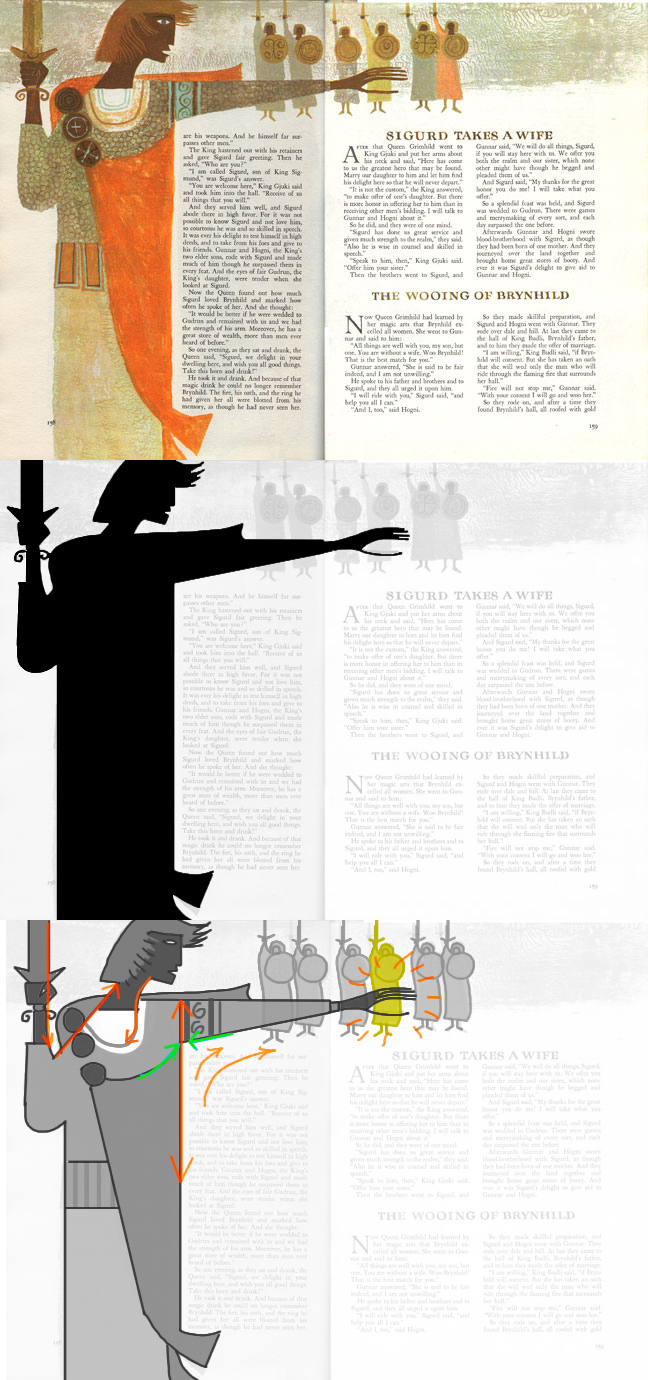
So I just wanted to remind you guys about how helpful it is to employ some good graphic design in your images, NOT just to capture the Provensens, but in all of your work.
See here how they have a strong silhouette, with the arms outstretched for a clear read of action. They even made sure there would be some breathing room around the sword-hand (which also functions as a nice compositional Stopper, whereas the other arm directs our eye through the image).
Then they broke up the silhouette shape, by doing a really cool juggling act--that is, drawing in the necessary costume details, but doing it in a way that works aesthetically on a completely abstract level! See how some of the lines totally flow through the form. Last time we talked about how it seems as though they get away with some really cool Tangents--do you see that here? And finally for good form, they add a line of near-identical soldiers in the background, creating a pattern for the eye (you'll see this happen much more with the Provensens, but also with their contemporaries such as Mary Blair--major patterns there!). But even though they are near-identical, they of course made one yellow--the same one to help the skinny hand POP!
GRAPHIC DESIGN MY LOVELIES
Let your mind be BLOWN!

6(sSDfBPzh+nDL7w~~60_57.JPG)


